Reference
Blocks
Reference
Blocks
Technically, blocks are a property of an object. In pages, blocks make up the body of your content. In media objects such as images, web links, tweets, or files, the blocks property is labeled with NOTES, as the main content can be regarded as the media item itself. In custom object types, one or several blocks properties can be added and named whatever you want.
Why blocks are useful
Blocks are a super flexible way of authoring content. You can rearrange them, create hierarchies by nesting them, hide content using toggles, or make use of multi-column layouts.
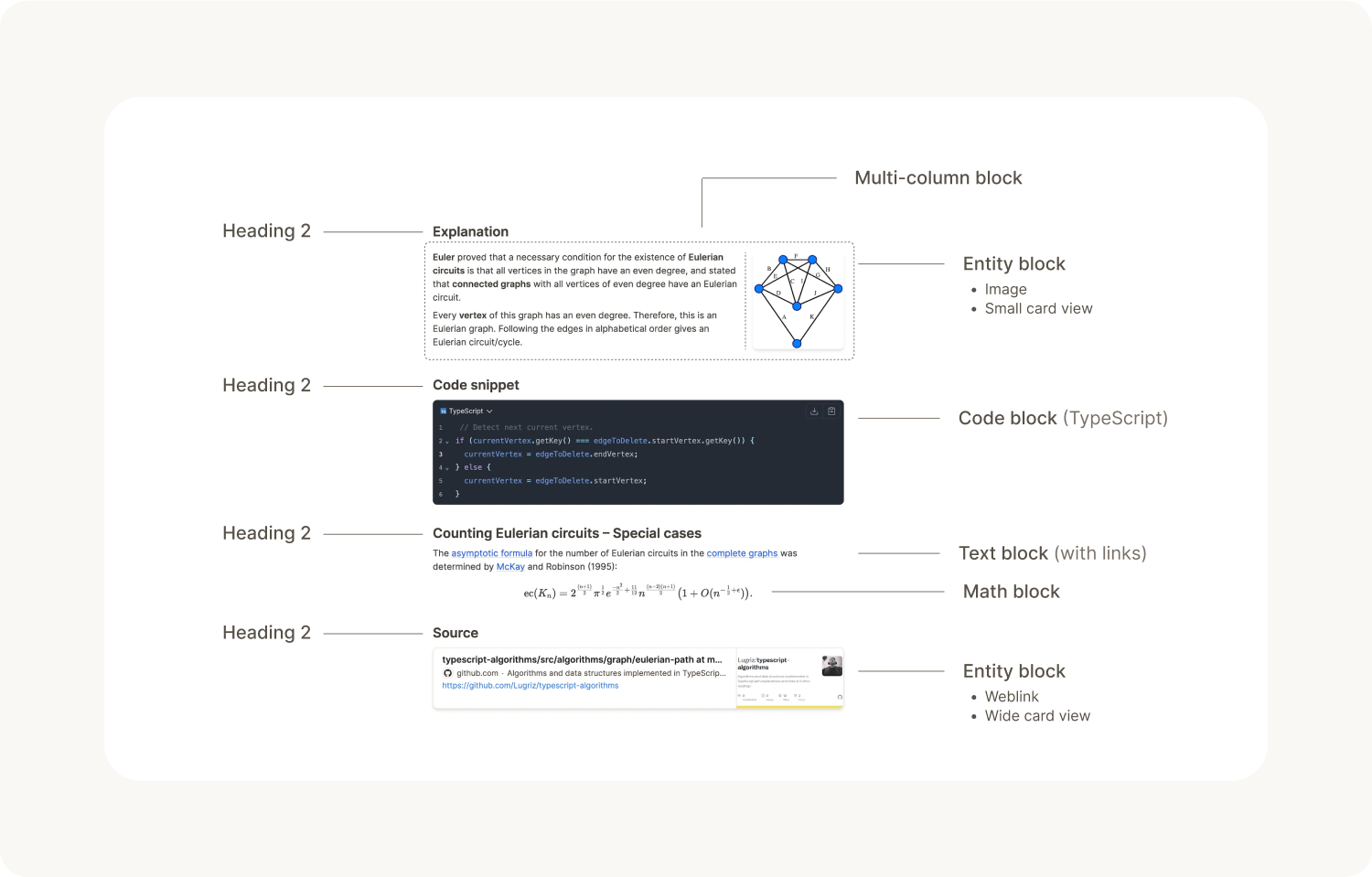
There are different types of blocks. Here is the list of blocks Capacities currently offers.
Text block
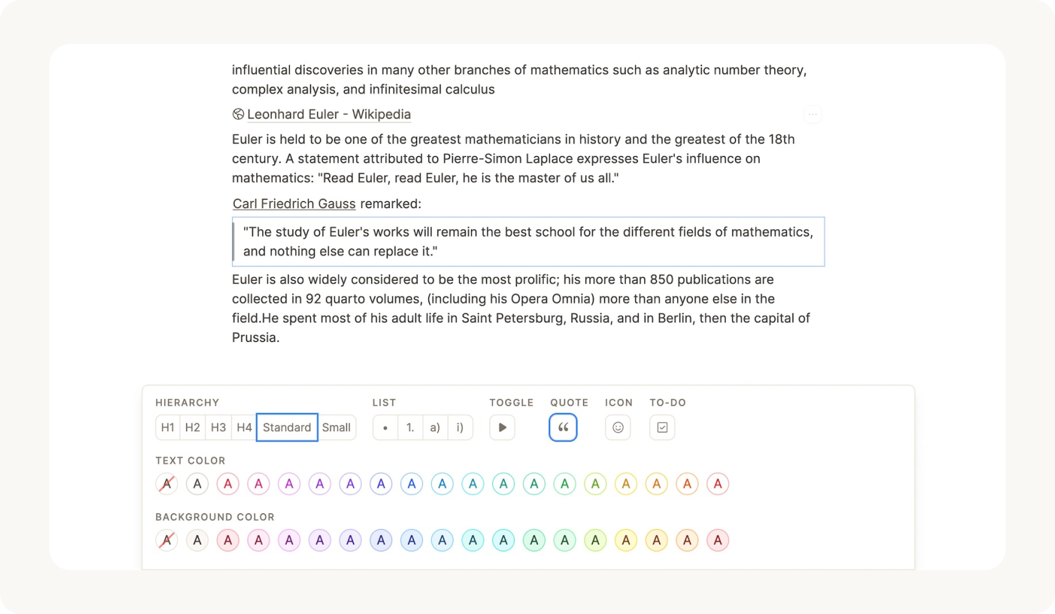
Text blocks are all blocks that let you write and format rich text. Capacities lets you build just the text block you need by letting you combine different interfaces:
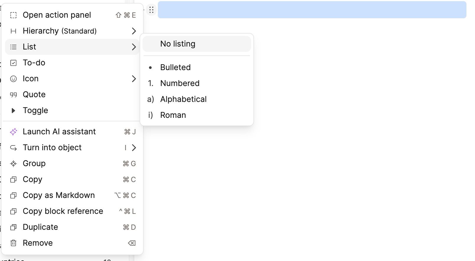
- Hierarchy interface: Choose between
Standard,Small,Heading 1,Heading 2,Heading 3, andHeading 4. - Toggle interface: If active, the block can be toggled.
- List interface: If active, the block will be rendered as a list item with options for
Bullet,Numerical,Alphabetical, orRomanlist style. - Quote interface: If active, the text block will be rendered as a quote with a bar at the left side.
- Emoji interface: If active, an emoji will appear in front of the block. If you click on it, the emoji picker opens and you can select any emoji you want.
- To-do interface: If active, a to-do checkbox will be rendered in front of the text.
Highlight Blocks
If you use one of our reading integrations (Readwise, Kindle, Web Highlights), your highlights will import into Capacities as highlight blocks.
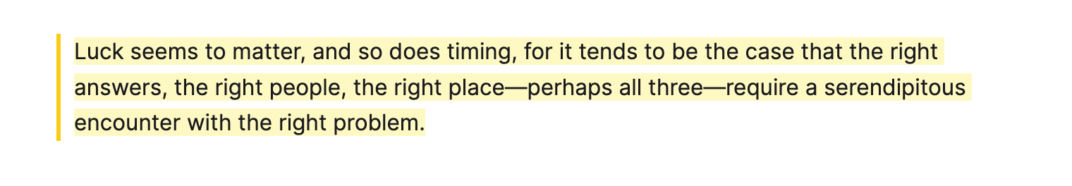
Read more about them here.
Code block
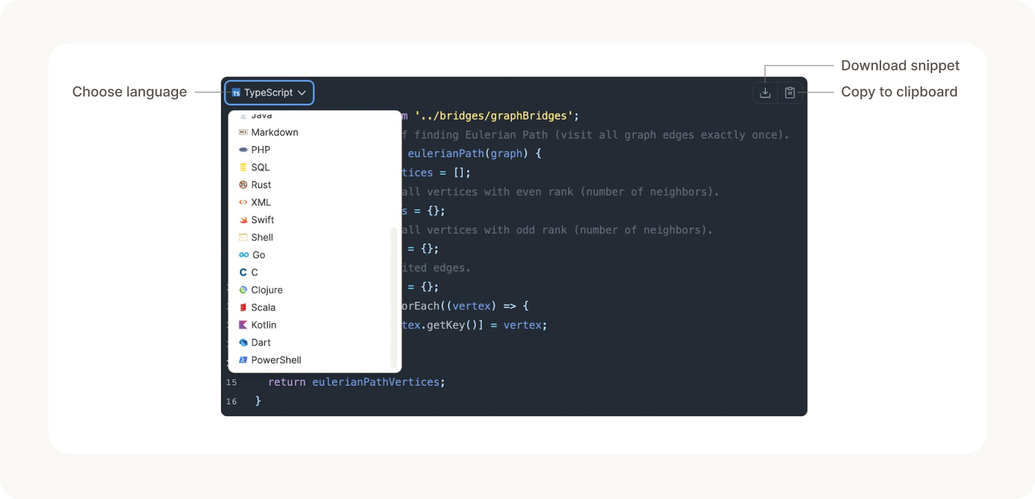
The code block allows you to add code snippets to your notes and edit them with a nice code editor. You can select from a wide variety of popular programming languages for syntax highlighting. The code block allows you to quickly copy the snippet to your clipboard or download it as a file.
Mermaid diagrams are supported in code blocks.
Math block
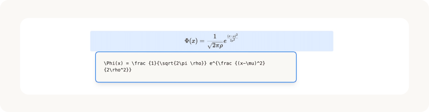
The math block lets you add mathematical formulae to your notes using TeX syntax. You can find a full reference of all available functions here.
To use in-line math, use the Cmd M (Mac) or Ctrl M (Windows) shortcuts.
Table block
Table blocks give you a more structured way to display information in your objects. You can read more about them here.
Layout blocks
Layout blocks help you create beautiful content with a structure that makes sense.
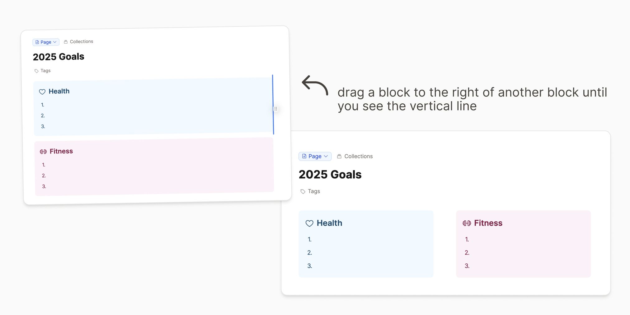
Two-column block
The two-column block lets you arrange blocks in multi-column layouts. Just drag blocks next to each other to put them in a column to the left or the right. You can even create more than two columns next to each other by dragging blocks to the left or right of, or in between the existing columns.
The style options of this block offer a setting for
- the layout width (
Standard(default),Wide,Full) to make the multi-column block wider than the main content, - the column layout (
Columns(default),Grid). Setting it toGridwill make items in the same row also have the same height, and - styles to change the text or background color of the whole block.
Group block
The group block can be used to put several other blocks inside a box to sets them apart from your other content. Open one of your objects, select the blocks you want to group and either use the Cmd + G (Mac) or Ctrl + G (Windows) shortcut, or click the 6 dots to the left of a block and choose 'group'.
There are settings for
- the layout width (
Standard(default),Wide,Full) to make the group block wider than the main content and - styles to change the text or background color of the group block.
To edit these settings, select the group block and the action panel will pop up with these settings.
Horizontal line block
This block is just a simple horizontal line that you can use to separate different sections.
Object block
An object block is a block that references another object of a certain type. This could be an image, a page, or any custom object type you've created.
If you add an image as a block, that's an object block of type image. 🌄
You can create an object block by creating any new object (with the + or / command or pasting a file from the clipboard) or by reusing an object with the @ command and then searching for it in the dropdown that opens.
An object block supports different views. Objects can be displayed as an inline (icon and title), as a small card, as a wide card, or as an embed. An embed lets you edit the embedded content in place (a concept called transclusion). The design of the views may vary depending on the type of content. Some basic object types also offer additional views. Images, for example, can be additionally displayed as a small or large square or in full-width mode.
Using these different types of blocks
The quickest way is to use the / or + functions. When you type these, you get a list of things you can do. This includes creating new objects, but also these block operations.
For example
/ + bullet + enterwill start a bullet point list.+1 + enterwill add heading one/blue + enterwill create a blue background/code + enterwill create a code block.
However you can also access all of these options from the 6 dots that mark the start of each block:

Selecting Blocks
You can click and drag to select an area of blocks. Rectangle selection also includes block references.
Alternatively, on a Mac, hold Cmd + Shift and click to select specific blocks. On Windows, use Ctrl + Shift and click on each block you'd like to select. You can click on a block again to deselect it.
Code blocks and number blocks
If you want to integrate your code blocks with a numbered list, create your list first and then nest you code block beneath it. You can do this by clicking the 6 dots to the left of the code block and click tab.
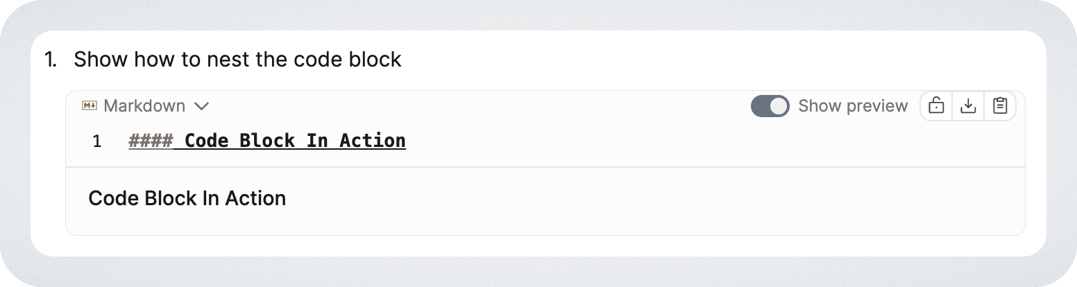
See this in action
Our editor quick tip will let you see some of this in action!
FAQs
- Can I copy a block reference on mobile?
Yes. Open the block menu (six dots), then choose Copy > Copy block reference, the same as on desktop. - Can I fetch all to-do blocks?
No, this isn't possible.
Ask a question! - The Docs Assistant knows everything about the documentation, and the ideas and feature requests from other users.
Create a ticket on our feedback board. - Let us know if you have an idea for a feature, improvement or think there is something missing.
Request additions to the documentation. - If your questions are not getting answered, let us know and we will extend the documentation.