Reference
Object types
Reference
Object types
An object is the fundamental unit of content in Capacities. Every object in Capacities has a type. It tells you the type of information stored in the note.
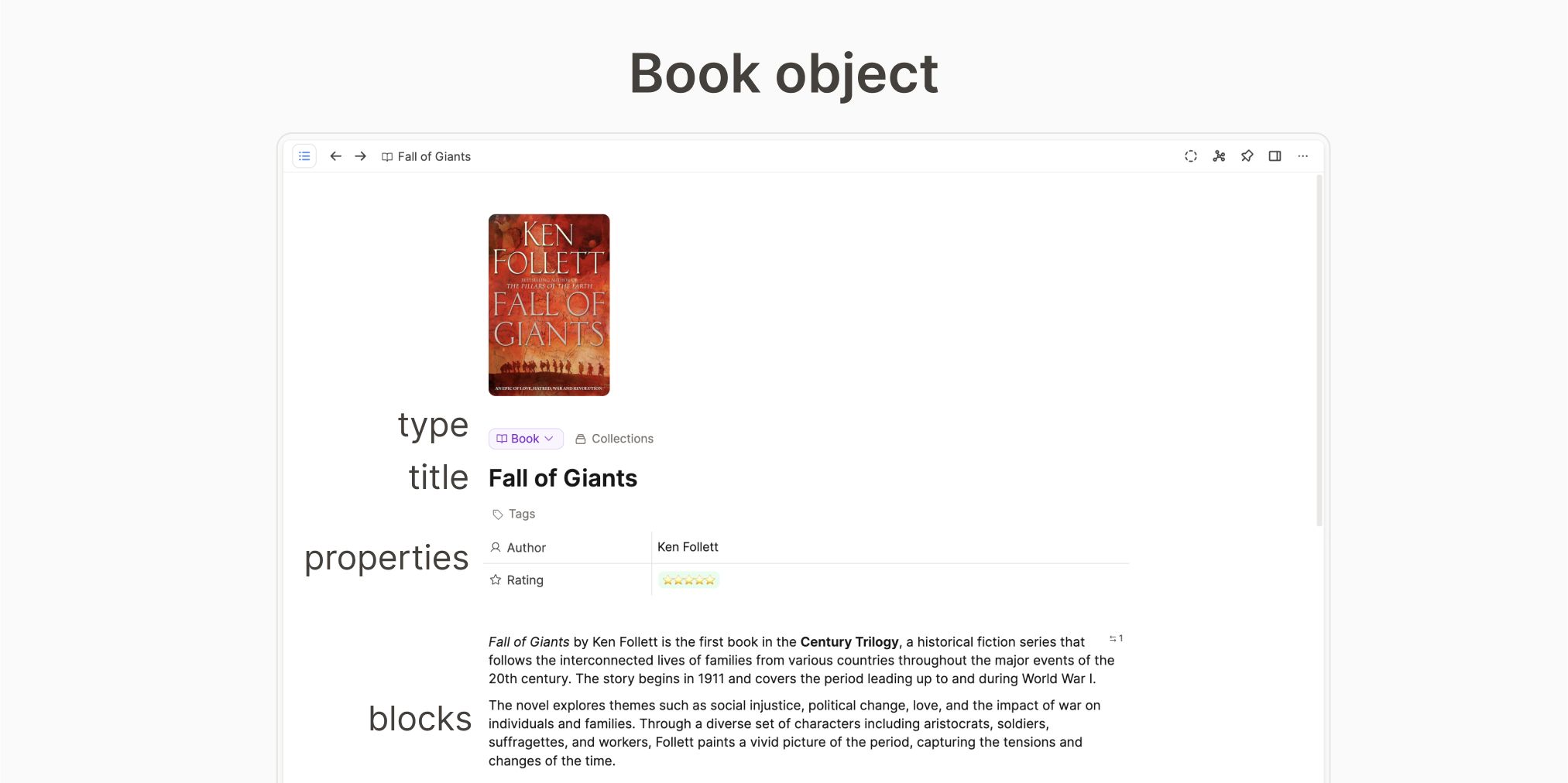
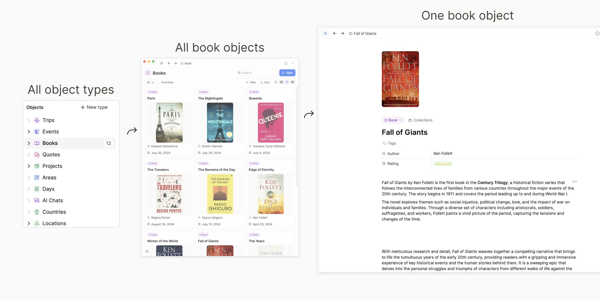
All your object types live in the left sidebar. All your objects can be found within one of them, because your objects are always an instance of one of the object types.
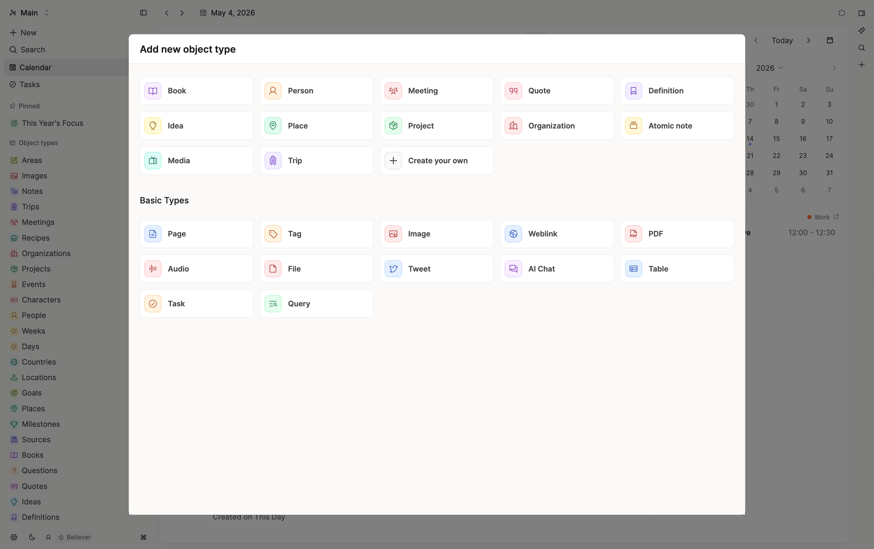
Object types are either created automatically by Capacities, or you can create them yourself. The first group is what we call Basic Object Types, and the second are Custom Object Types. Their settings define the structure of the content. Read on to see how this works.
Basic object types
Basic object types are types that are built into the app. Each user has access to them.
Basic types are designed to be useful to all users and to cover the most basic use-cases first. Since basic object types are built into the app, we can give them a tailored design and functionality. We can make them more powerful with custom functionality. That’s their big strength.
Here are all basic object types in Capacities:
- Page
This is the simplest object type for writing notes. Everything is set up for you, all you need to do is start typing!
Read more about the pages here. - Tag
Tags are a very useful organization object type in Capacities. Think of them like keywords that you can assign objects or blocks. If you click on a tag, you can see all of the places it has been used.
Read more about tags here. - Image
Any image you input into Capacities becomes an image object, that can be reused anywhere in your space.
Read more about images here. - Weblink
Any links you paste into Capacities will be recognized as a link, and you will have the option to create a weblink from them, or to keep the plain URL. The one difference is that the URL is just a link, whereas the weblink is an object that gains all the functionality of other objects with some extra features.
Read more about weblinks here. - Audio
You can save audio files to Capacities via upload, Whatsapp or Telegram.
Read more about these here. - PDF
You can upload PDFs, read them and tag them in Capacities so they become part of your notes.
Read all about this here. - Files
You can store files of various types in Capacities. This allows you to integrate them with your notes by referencing them or tagging them.
You can read more about them here. - Tweet
Whilst the full Twitter/X integration is disabled until further notice due to API changes, you can still save URLs of Tweets to Capacities. Every time you do this, the link will automatically become a Tweet object.
You can read more about this here. - AI Chat
Sometimes you might want to come back to chats you've had with the AI assistant. Saving them as objects allows you to do that.
See more here. - Query
Queries collect content based on rules. All queries you create are saved as objects for you to reuse in your capacities space.
See more about queries on their page. - Table
Tables are a great way to visualize structured data. You can either use them as blocks in your objects, or turn certain tables into table objects.
You can read more about this here.
Custom object types
Custom object types can be customized to your preferences. You can choose how to set up...
To get started, follow the tutorial on custom object types.
Not sure if you need a new type? Read when to create a new object type.
If you want to get inspired you can find common custom object types here.
And if you want to share ideas and best practices feel free to use our # 🎓 · showcases channel on Discord.
Where to find your object types
All your object types, both custom and basic, will be in the left sidebar.
Click on an object type, to see all objects of that type.
When you open an object type, you will be taken to the object dashboard.
Object Dashboards
Every object type has an object dashboard that you can customize. Each dashboard is unique to the object type it's connected to, so you can choose to have a different object type set up for meetings, compared to people or topics for example.
There are built-in sections that you can use:
- Recently opened objects
- Untagged objects
- Objects not in a collection
- Objects with no backlinks
- Collections
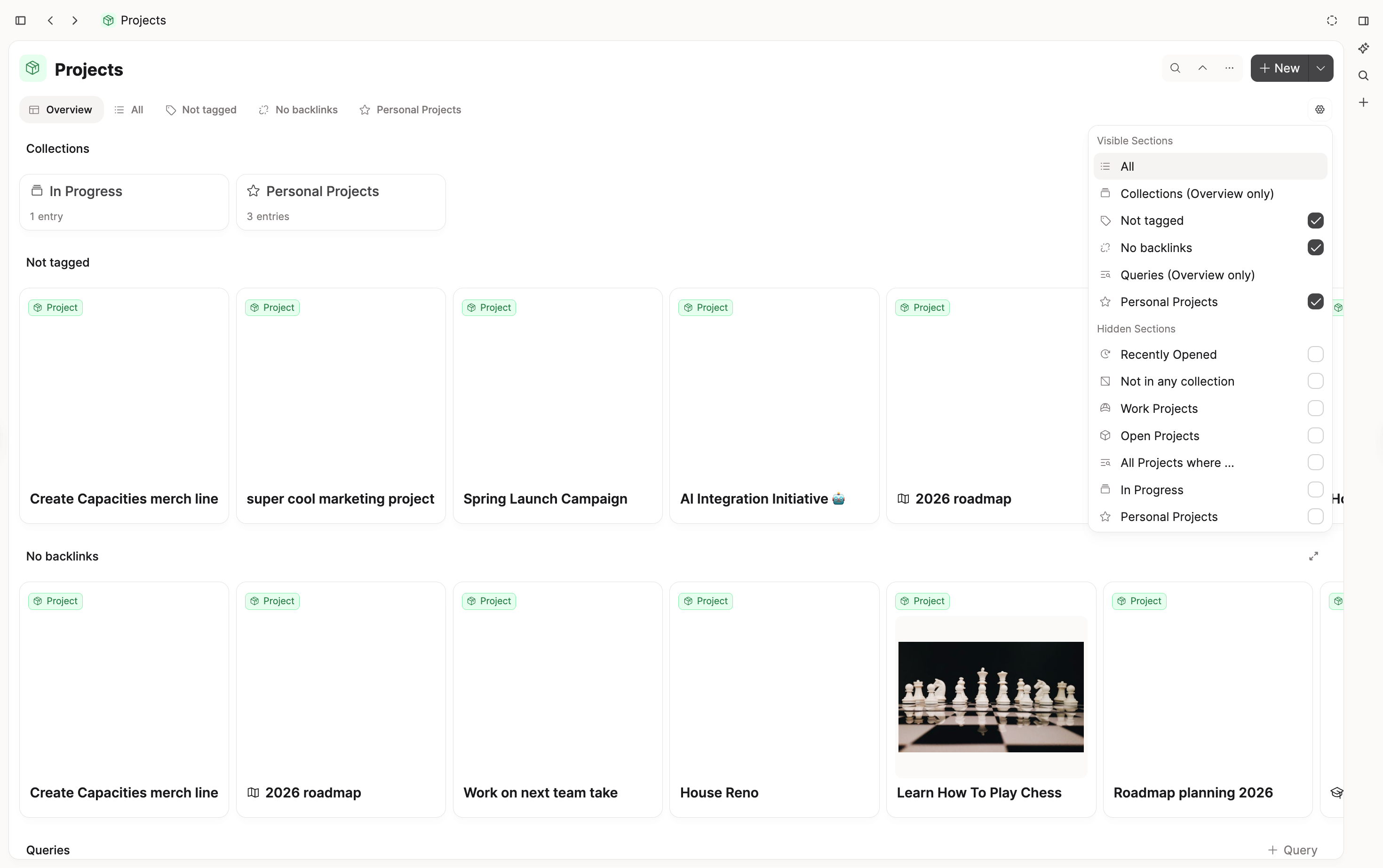
To add sections, hover over the tabs and click +. You'll see the options you can add. Recommendations suggests ready-made queries you can start from (for example filter by a label, show checked or unchecked items, or a kanban grouped by labels).
You can rename queries and collections from the dashboard tab menu without opening the full query page.
If you want to remove a section, click on the tab name so that the small menu pops up. Click Remove.
Create your own sections
Capacities ProPro users can pin queries to their dashboards too. When you create an object type query, there will be a button in the top right called "Pinned to Dashboard". Click this to have that query become a section available to add to your dashboard.

Pro users will also have a section called "Queries" which collects all queries for this object type.
See all content
When you open an object type, it will have a button under the title that says "All".
Click on that button to access all objects of that type.
From here, you can filter, sort and group your objects.
Filter, sort and group by
You can filter to see only the items you need, sort them into a useful order, and group by a property to view them in meaningful categories.
Filtering
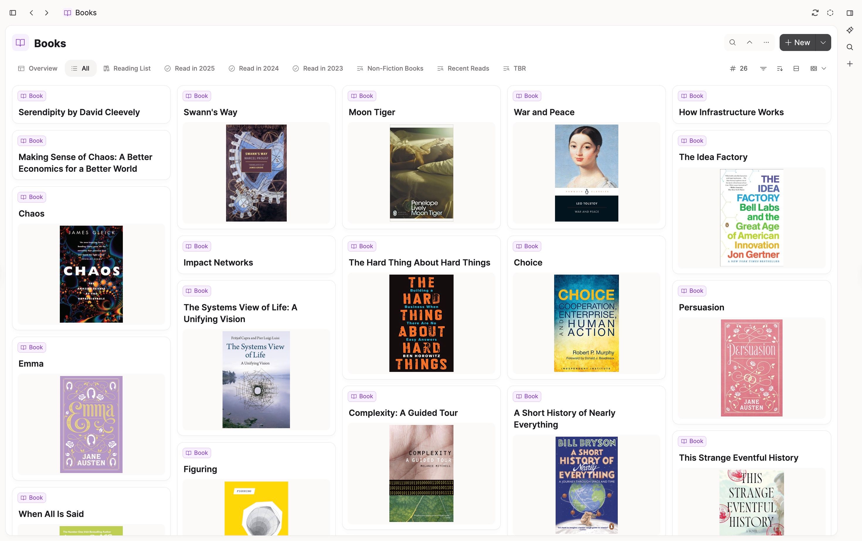
If you want to find a specific group of content within a type based on its properties (e.g. all meeting notes from the past week, all books read in 2024), first open up the specific object type first (meetings, books) and then click "Filter".
Choose the property you want to look at in more depth, and the parameters you wish to set.
This will show you the relevant objects.

Pro users will be able to save these filters as queries.
Sorting your content
If you'd like to see your content arranged in a certain order, you can open your object type and go to the buttons on the right hand side. There you wil find the sort button.
You can choose which property you would like to sort your objects on from there.
For sorting settings you use a lot, you can save them as a query. E.g books read in order.

Grouping your content
If you'd like to arrange your content into groups, click the Group By button and choose what property you'd like to base your groups on.

Learn more here.
Save views
Click '+ Query' to save this view. You can reuse it in any object by typing its name.
Type conversions
If you have objects assigned to an object type that no longer fits, or you just want to change things up, you will need to know how to change object types.
Above each object's title, there is a label which tells you which object type it has. Click on that label and a dropdown menu appears. This allows you to choose which new object type you want your object to have. Click on the one you'd like to choose.
A pop up window will then come up that compares properties between each object type. Make sure your important information has somewhere to go in your new object type.
Once you're happy, click the blue button and your object and all the content you've chosen to move, will have moved!
This feature also works for collections. On a collection page, use the dropdown next to the type label.
This allows you to move a collection to another database within a few clicks. It makes reorganizing your knowledge base simpler and faster. You can now conveniently start by just using pages and later organize them into people, meetings, atomic notes, and more once you need a more granular organization. 💡
FAQs
- I can't find the 'New object type' button in the left sidebar
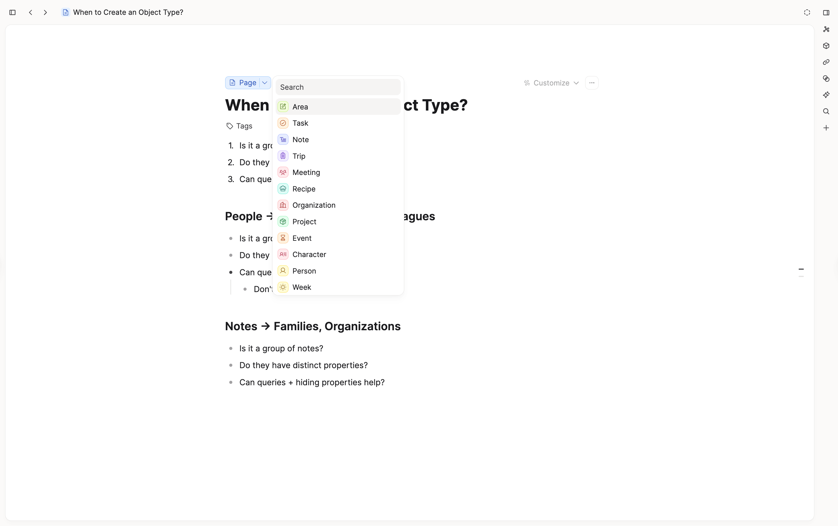
Go toSettings > Object Typesand click New. - When should I create a new object type?
If a group of notes has distinct properties and you can't achieve what you need with queries or property visibility alone, it's worth creating a dedicated type. See the full guide: When to create a new object type. - How do I delete an object type?
Open the object type settings and scroll to the bottom, you will find a button to delete the object type. - What happens when I click "Unpin from Dashboard"?
This removes that section from the current object type dashboard only. For example, if you unpin "Consulting" on the People dashboard, it will no longer appear there as a tab/section.
This is different fromUnpin from Space, which only removes an item from the left sidebar pinned section.
Ask a question! - The Docs Assistant knows everything about the documentation, and the ideas and feature requests from other users.
Create a ticket on our feedback board. - Let us know if you have an idea for a feature, improvement or think there is something missing.
Request additions to the documentation. - If your questions are not getting answered, let us know and we will extend the documentation.