Small Card View Customization
Small Card View Customization
The small card view of each custom object type can be configured to show or hide properties on the card. You can decide exactly which properties are displayed and in which order they appear.
How to customize
To customize the view, go to Settings > Object Type > select your object type > Customize card view section.
You can also access the object settings by clicking the three-dot menu (...) on any object.
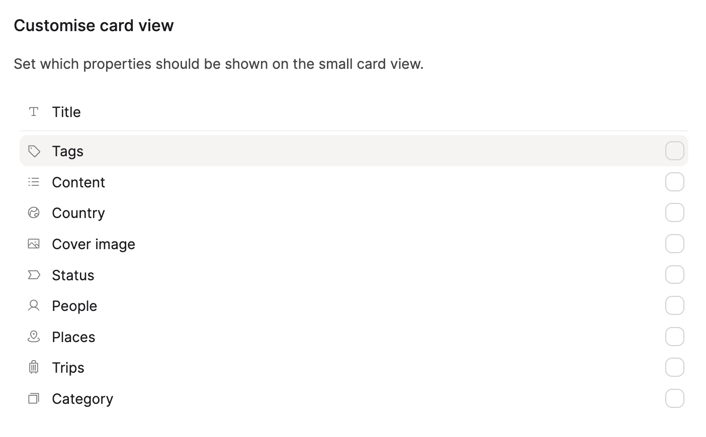
The title is mandatory in small card views, but you can choose to show or hide any other property. Vote here if you would like to hide the title. Note, this is not currently planned.
Reusing this view elsewhere
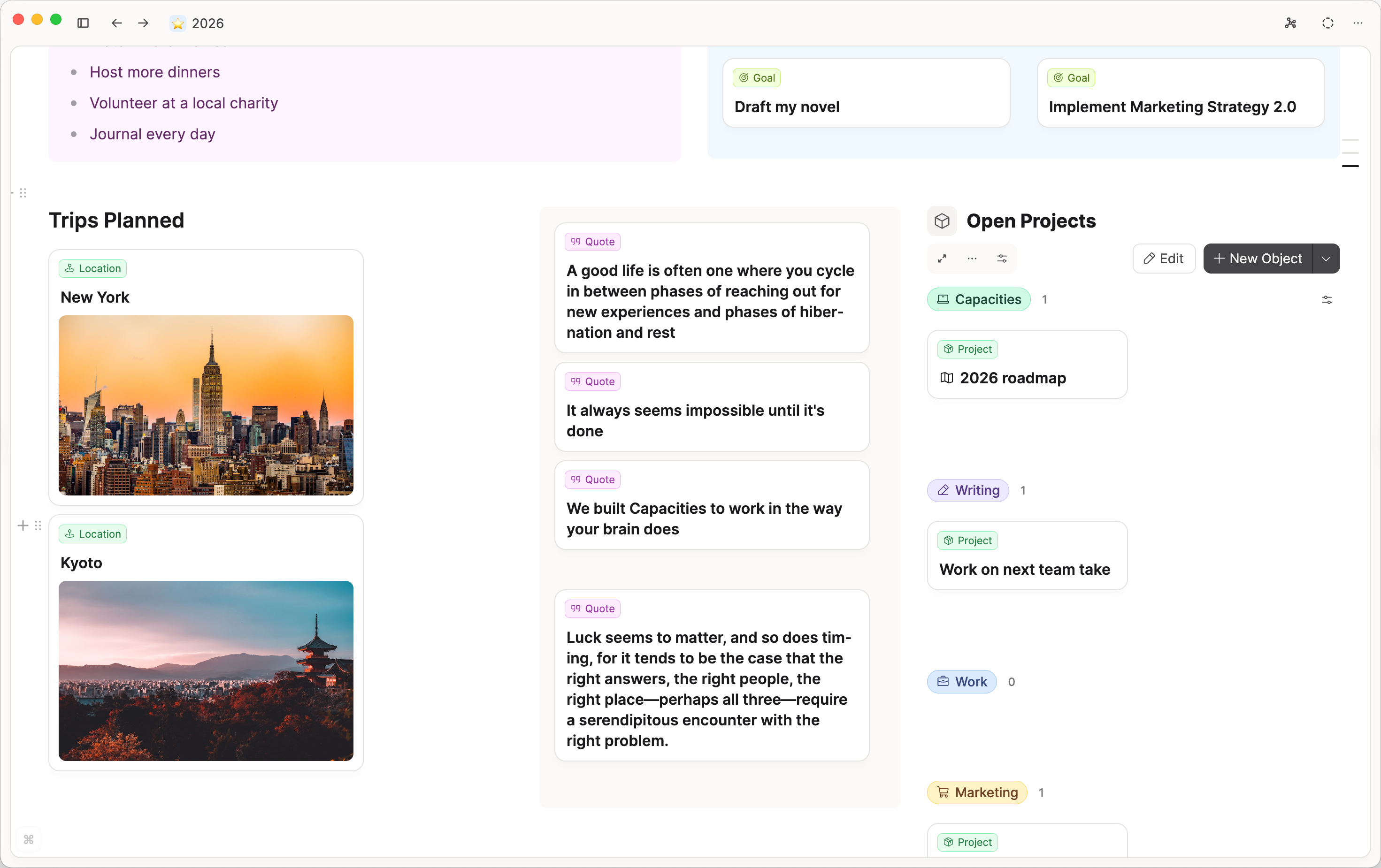
Once you have configured the view, this configuration will be applied consistently across the wall view and gallery view for that object, as well as in the small card view of any item embedded from that object.
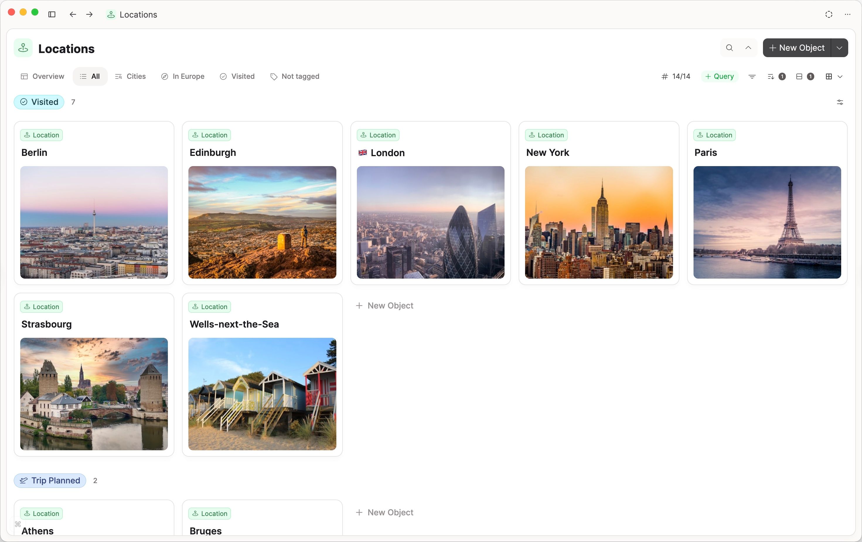
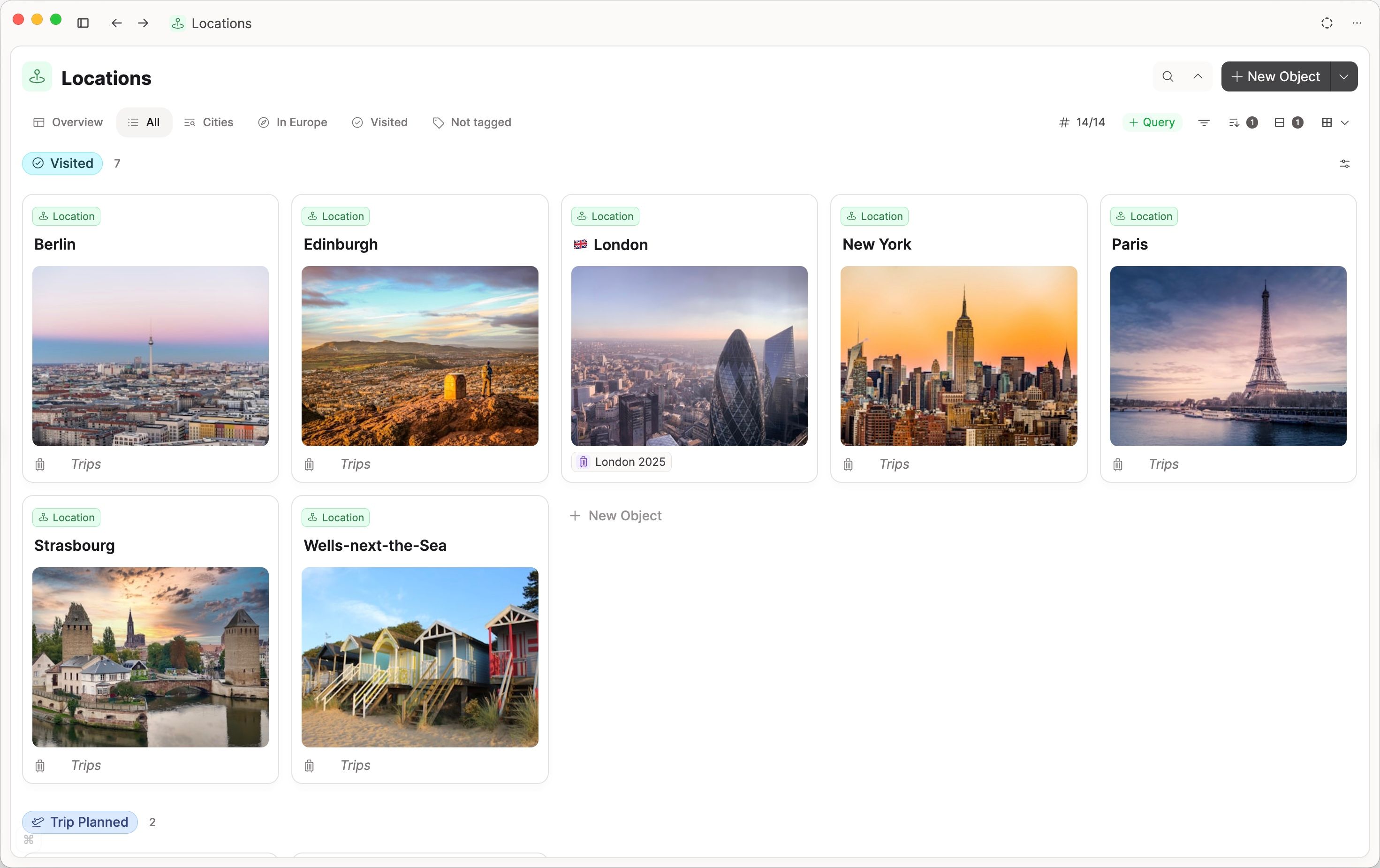
The gallery will show all selected property fields even if they are empty, whereas the wall view hides those properties until they are filled, keeping the view more compact.
Gallery view displays all selected properties, even when they are empty
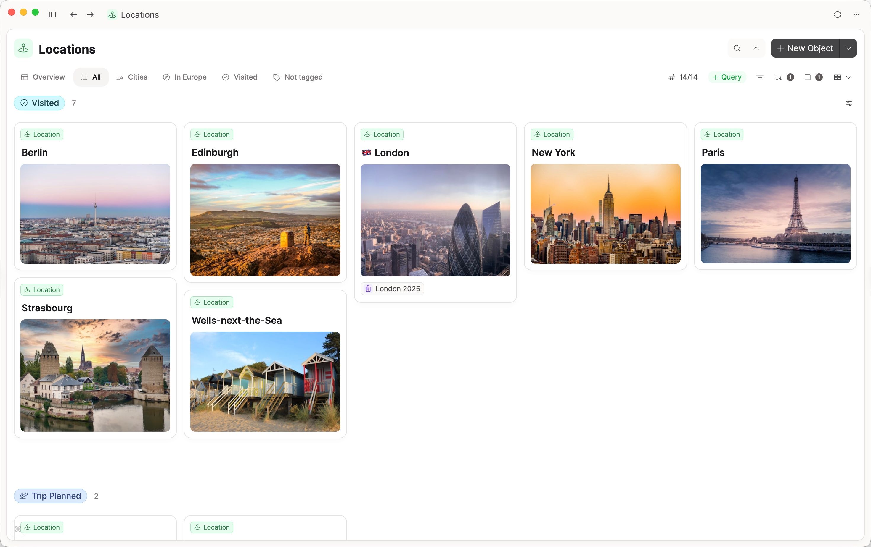
Wall view hides empty properties
Most properties are editable directly on the small card, which allows you to quickly fill out dates or object select properties. However, number, blocks, and text properties cannot be edited on the small card.
FAQs
Why can’t I see card view customization options? You are probably using a basic object type (such as page or weblink). Their small cards cannot be customized. Only custom object types support small card customization.
Ask a question! - The Docs Assistant knows everything about the documentation, and the ideas and feature requests from other users.
Create a ticket on our feedback board. - Let us know if you have an idea for a feature, improvement or think there is something missing.
Request additions to the documentation. - If your questions are not getting answered, let us know and we will extend the documentation.